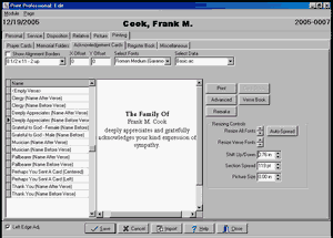
When you click on the Acknowledgement Card sub-tab of the Printing Tab, this window will be displayed.

Show Alignment Borders is a Check Box. Placing a check here will cause boxes to print around your cards. You wouldn't normally do this when you were actually printing to your Acknowledgement Card Stock, but sometimes the boxes are useful when you print to a plain piece of paper or wish to adjust margins.
The List field that initially displays "8 1/2 x 11 - 2 up" is the Paper Size List. All of the popular variations of acknowledgement cards are on the list. In addition there is a Custom Card Size choice which when selected allows you to use the Card Stock Button at the right of the screen to specify a custom configuration.
Below the Card Size list is the Verse List. Double clicking on the name of the verse will incorporate it into your card - unless you've chosen a Data Set without a Verse. It is best to select your Font and Data Set before choosing your verse. To add your own verses to the list, click on Verse Book.
The X and Y Offsets move the print on the page. X is for left or right and Y is for up and down. You may move left or up from zero with negative numbers. The offset is in inches, but you shouldn't need to use any offset unless your cards are slightly off size and then small adjustments like .10 or .005 should be sufficient.
The Select Fonts List specifies the Font Set and Select Data specifies the Data Set List. We have preconfigured a number of Sets that we think are attractive but you may create more using the Advanced Button.
Fonts Sets are described with names like Old English Small(OldEnglish) or Bold-Old English Small(Opulent Bold-OldEnglish). In the first example, all of the printing is in an Old English font in a small size. Normally you would want a large size for Acknowledgement Cards unless your sentiment is very long. The program will shrink a large font to avoid overflowing a card but will not expand a small font; it does, however, adjust spacing between sections to even out white space. The second OldEnglish in parentheses is the actual name of the font. In the second example, two fonts are listed. The first font, Bold, indicates the font for headings while the second font, Old English, is for the data. In parentheses we see that the actual name for what we are calling Bold is Opulent Bold.
Data Sets are described with names like Name After Verse. Some verses are designed for the name to follow it and some expect the name to come first. Be sure to select a Data Set with the name in the right place for the verse you chose.
When you return to a Funeral, the window will display the card as you last printed it. You will be able to print more by simply clicking on Print. If you've made changes in the data though, you'll first need to click on the Remake Button to have the program recreate the card with the changed data. Changing Items on this windows such as the Font Set will also cause the card to remake. Some care needs to be exercised here though. While the program will display the card exactly as it was printed (it saves an image of the card), the program does not know the name of the verse you selected or the values of the List Fields you chose and so these items may not correspond to the actual saved card. In fact, they will correspond to the last funeral you worked on rather than the saved funeral which is normally a convenience in entering new funerals which may trip you up if you aren't careful. So you'll need to make sure these items are as you want them before you click on Remake.
The Resizing Controls allow you to fine tune the spacing. When the card is as you wish, click Print and the Printer Window will appear.